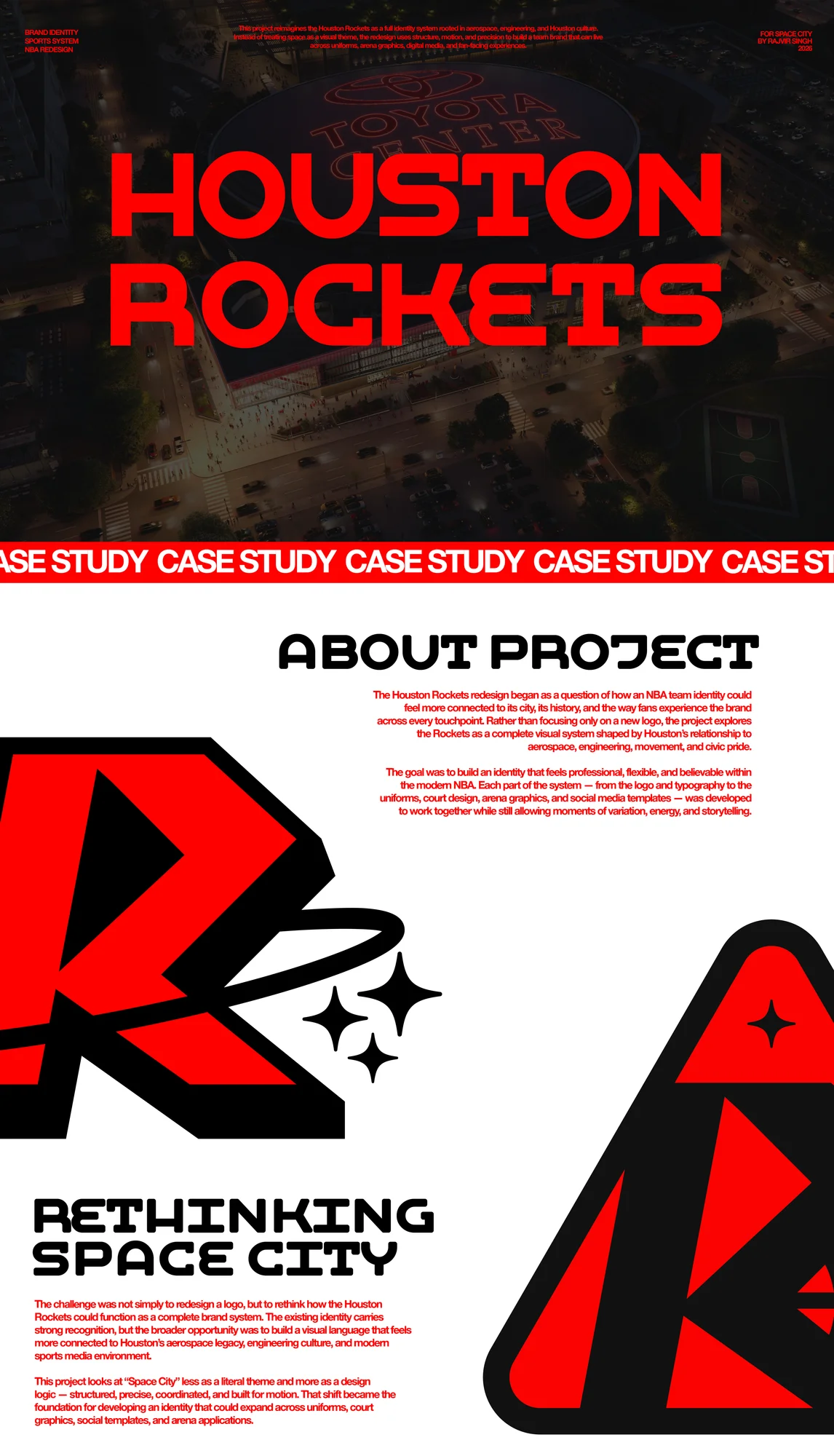
The Houston Rockets Rebrand is a complete sports identity system built across logos, uniforms, social media, court design, arena graphics, motion, and brand guidelines. Developed as an independent senior capstone concept, the project reimagines the Rockets through Houston's real connection to aerospace, engineering, and exploration — rather than relying on generic sci-fi visuals. The goal was to build a professional NBA-level brand system that felt flexible, culturally grounded, and usable across both digital and physical team applications.
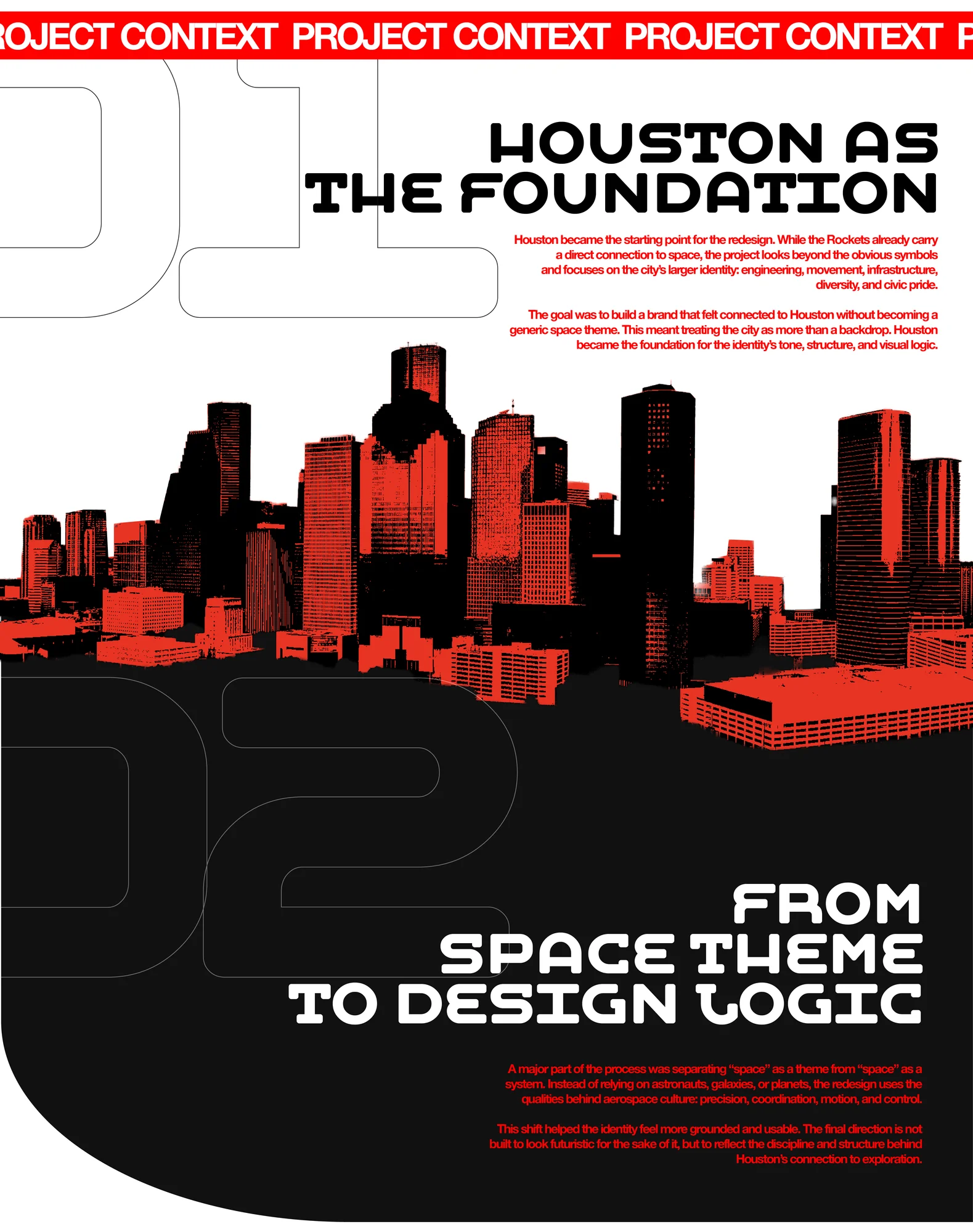
The Rockets already have one of the strongest thematic identities in the NBA, but "space" can quickly become too literal. Astronauts, galaxies, and futuristic effects can make the brand feel more like a fantasy concept than a professional basketball identity. The challenge was to keep the Space City connection while grounding the system in aerospace engineering, structure, precision, movement, and Houston culture.
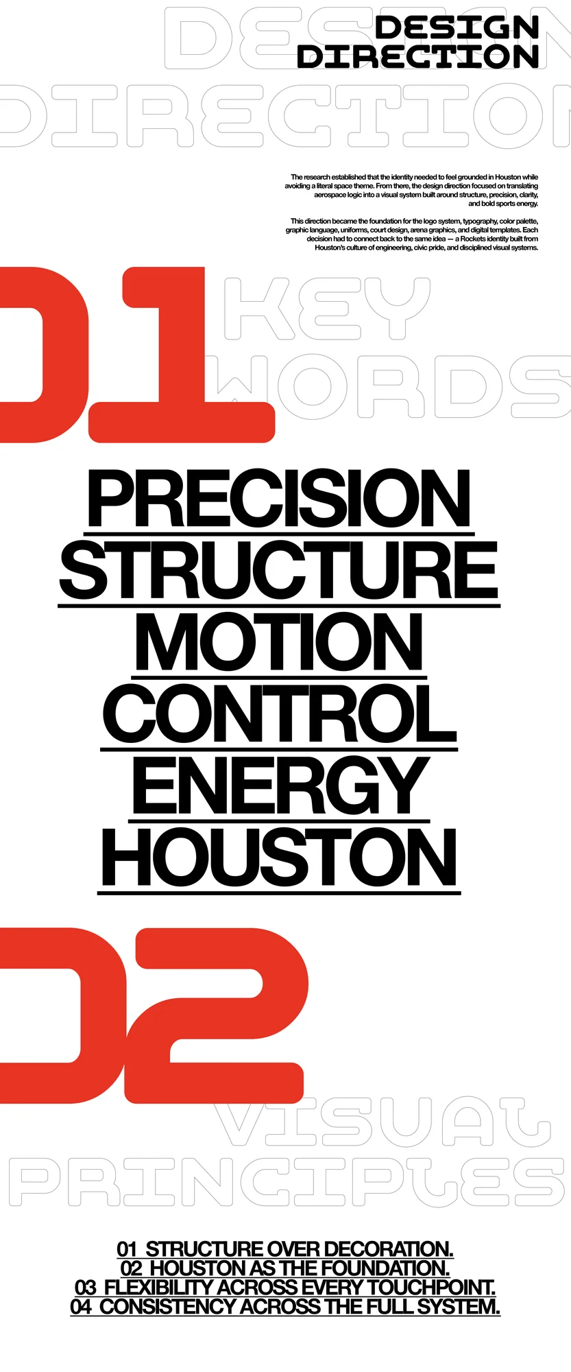
The concept is built around structured exploration — the idea that Houston's relationship to space is technical, cultural, and deeply connected to systems thinking. Instead of treating space as decoration, the identity translates aerospace logic into sports design through precision, coordination, launch energy, controlled motion, and modular structure.
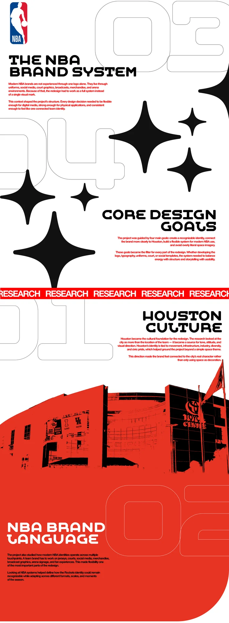
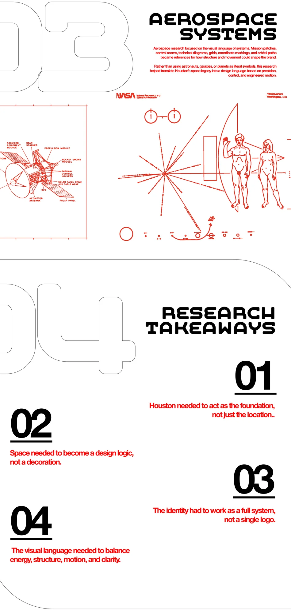
The project began with a full audit of the Rockets' visual history — logo iterations from 1967 to present, uniform changes across eras, arena graphic evolution, and broadcast identity — set alongside research into Houston as a city: its relationship to NASA and aerospace, its position as a major industrial hub, and the visual culture that comes out of that. Reference was drawn from major sports rebrands, contemporary NBA identity work, aerospace and industrial design systems, and mission patch graphics.
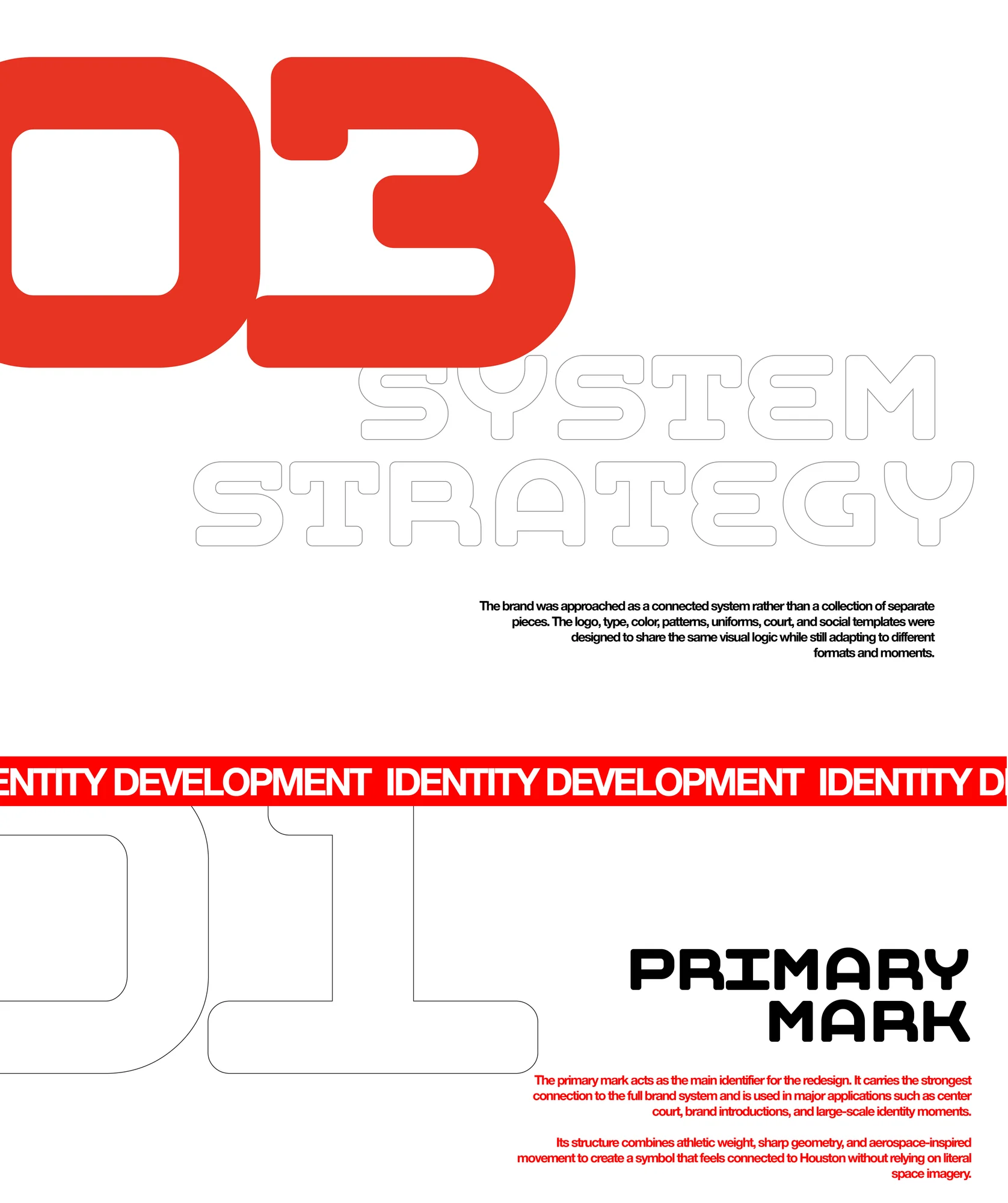
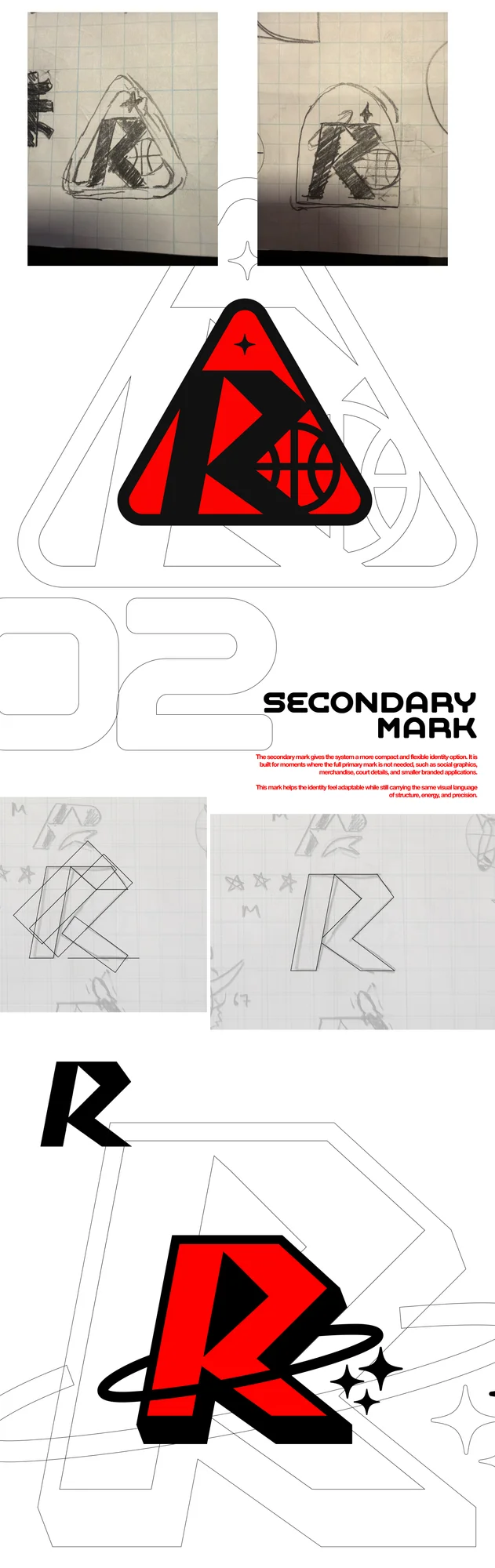
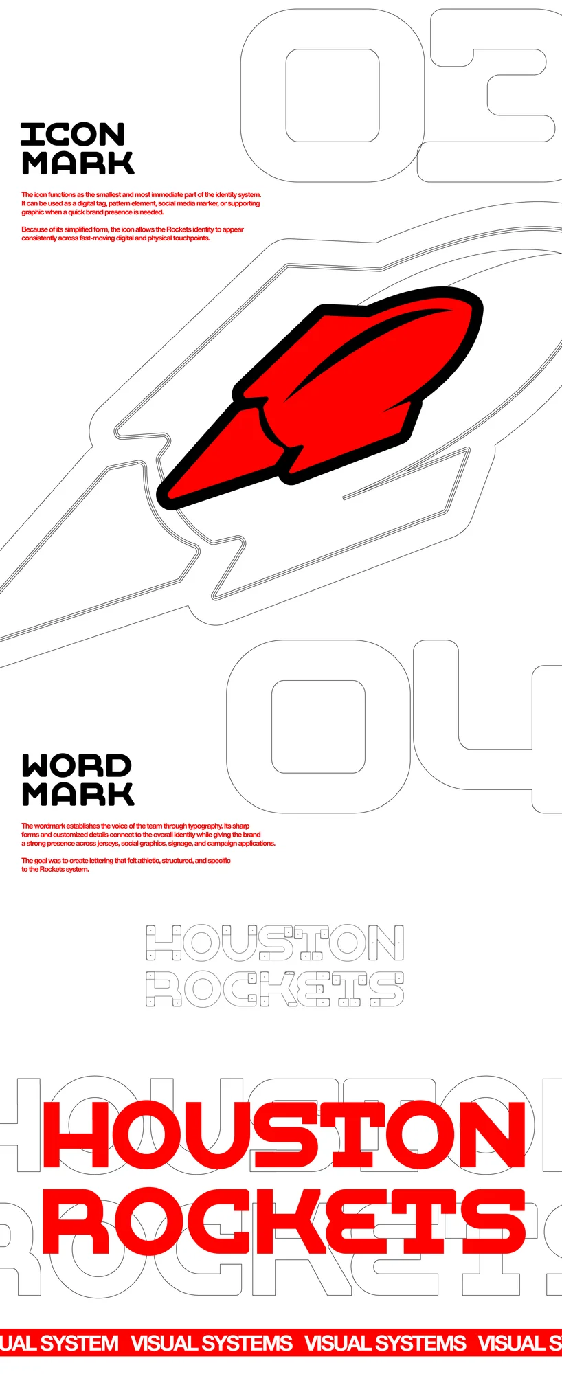
The identity was designed as a flexible logo family rather than a single mark. Each piece of the system has a specific role, allowing the brand to shift between official, athletic, digital, and environmental applications. The primary badge carries the strongest cultural reference, drawing from mission patch structure. The secondary mark works as a bolder athletic symbol for uniforms, court graphics, and high-impact applications, while the icon and wordmark support smaller digital uses, patterns, social graphics, and official team communication.
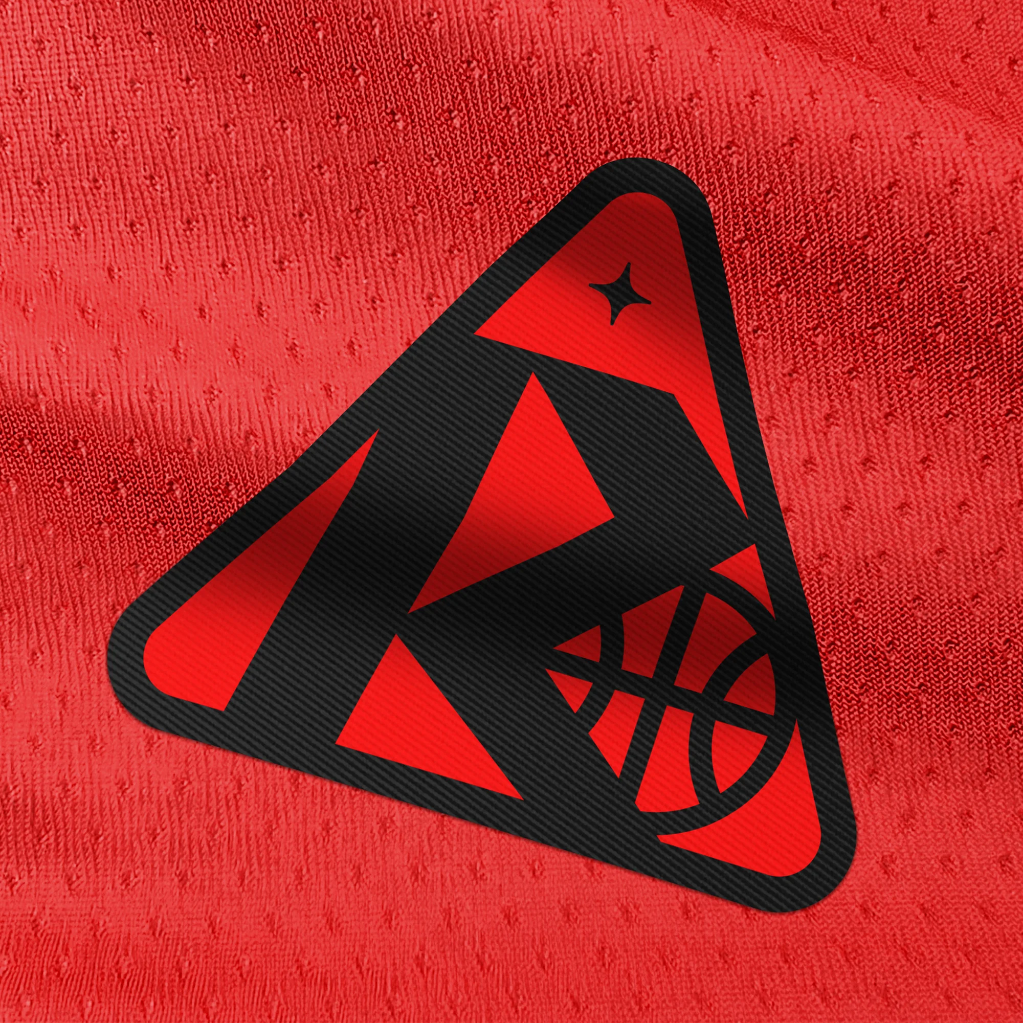
Logo System — Primary, secondary, icon, and wordmark applications
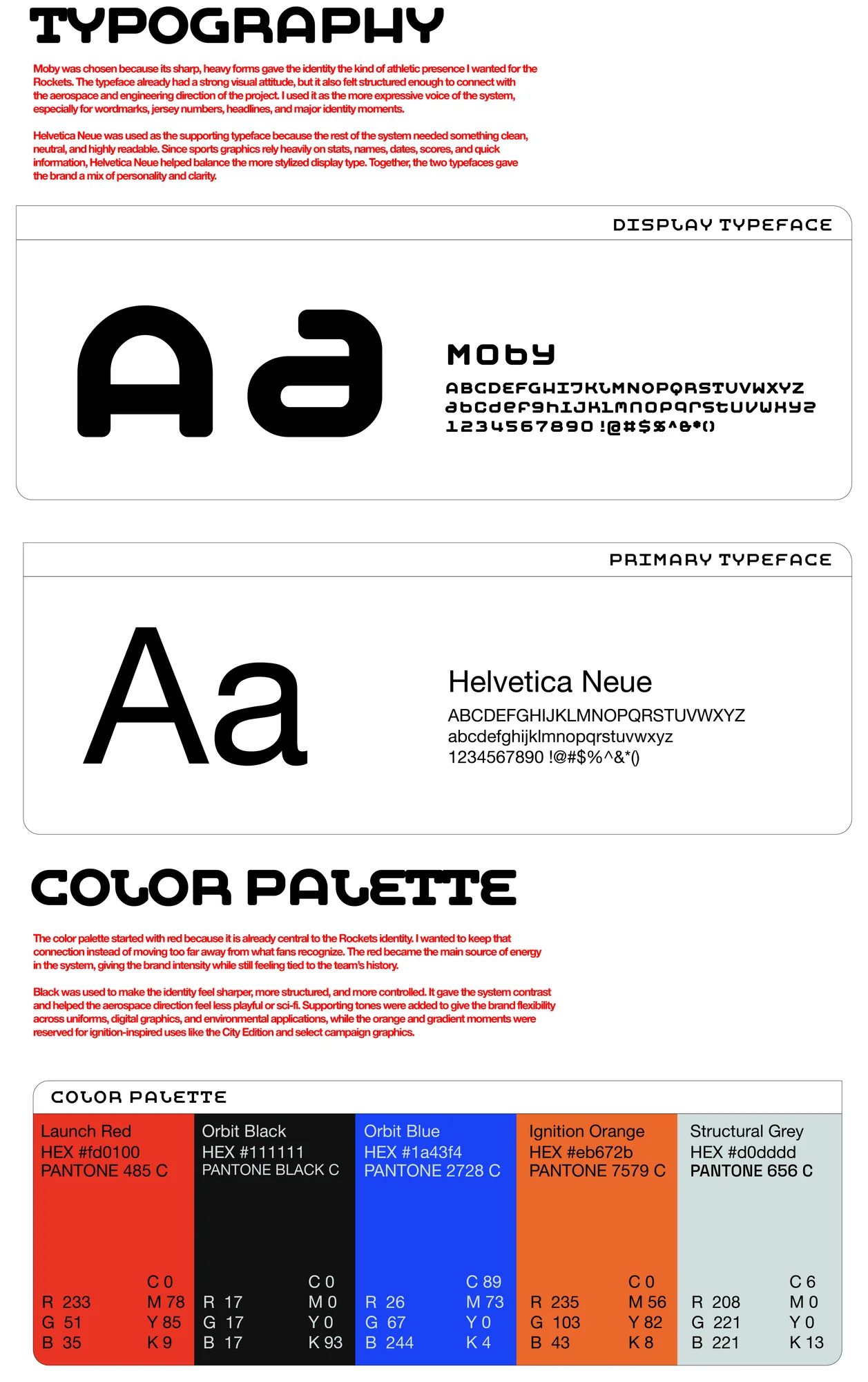
The color system keeps red as the strongest Rockets identifier while expanding the palette with structural neutrals, dark aerospace tones, and controlled orange and blue accents. These supporting colors allow the brand to move between official team applications, high-energy social graphics, and City Edition storytelling without losing consistency. The typography system balances expressive sports lettering with functional clarity. The custom display style gives the brand its athletic voice, while Helvetica Neue supports readable information systems across tickets, social templates, documents, and digital layouts.
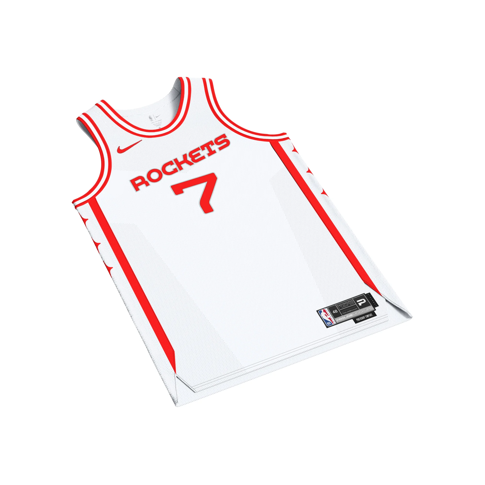
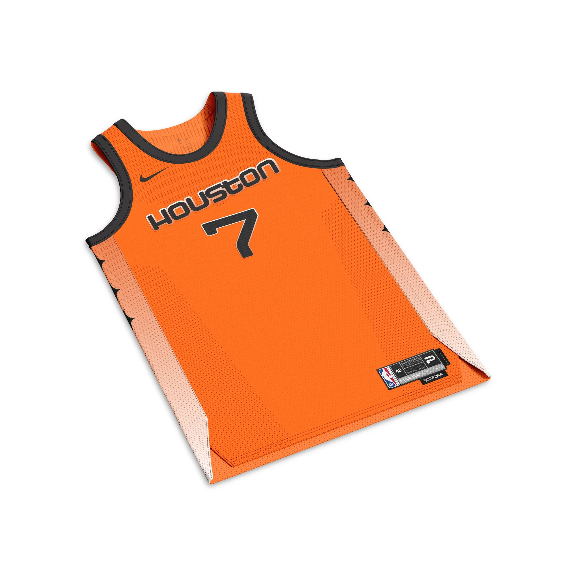
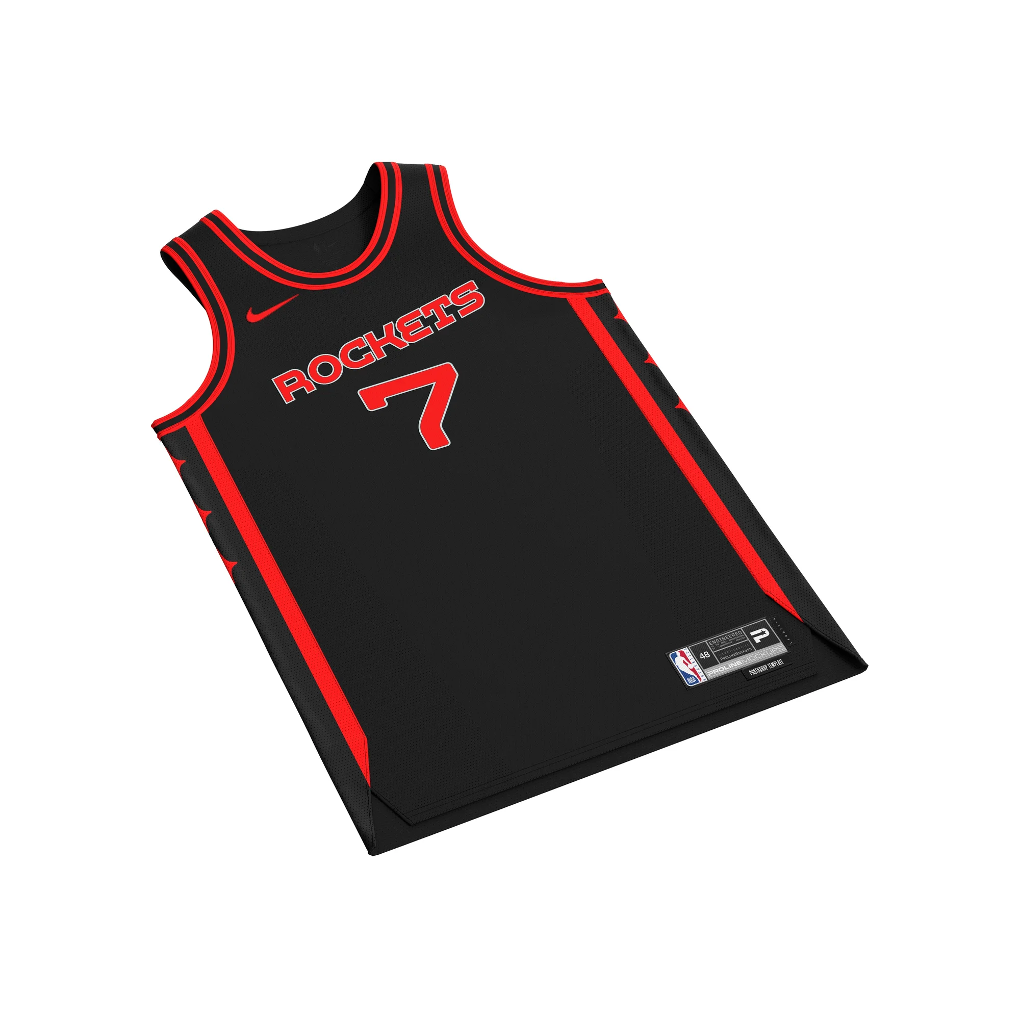
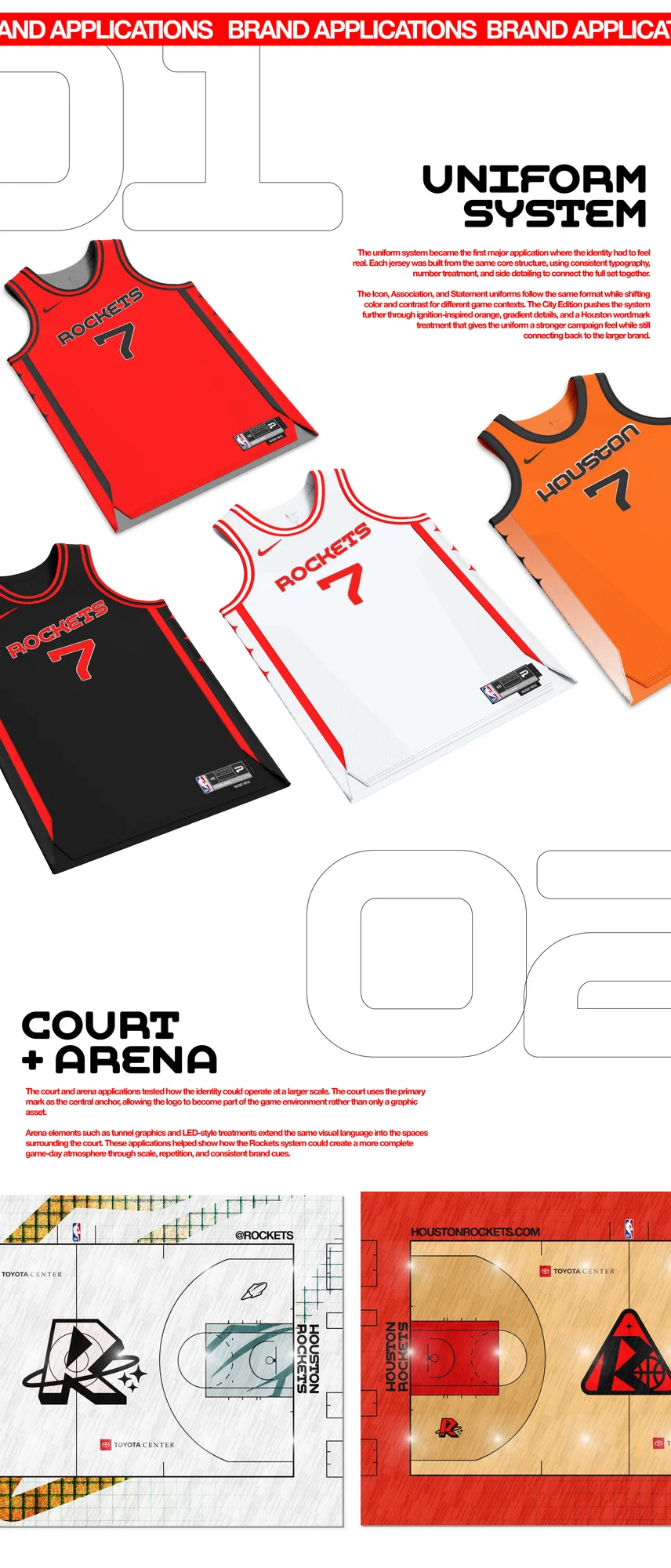
The uniform system applies the identity across a complete NBA jersey set. The Icon, Association, and Statement uniforms share the same structure, using consistent typography, logo placement, and side-panel detailing across each colorway. The three-star side detail creates a recognizable uniform element while connecting back to mission progression, movement, and controlled hierarchy. The City Edition expands the system through ignition-inspired orange, gradient details, and a stronger launch narrative while still staying connected to the overall visual language.
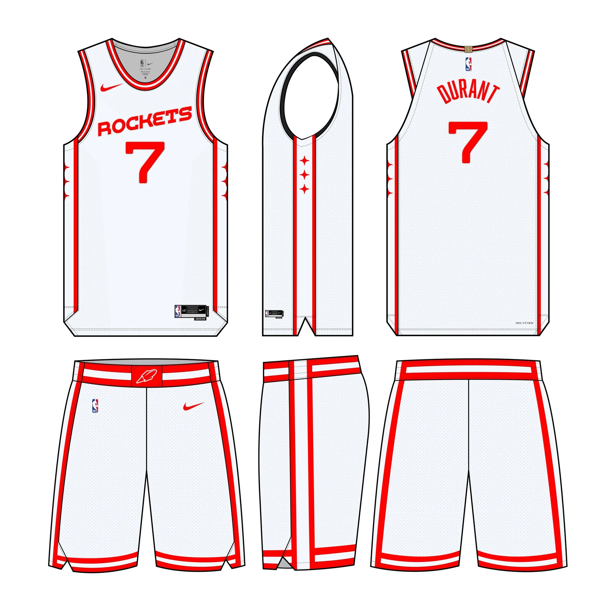
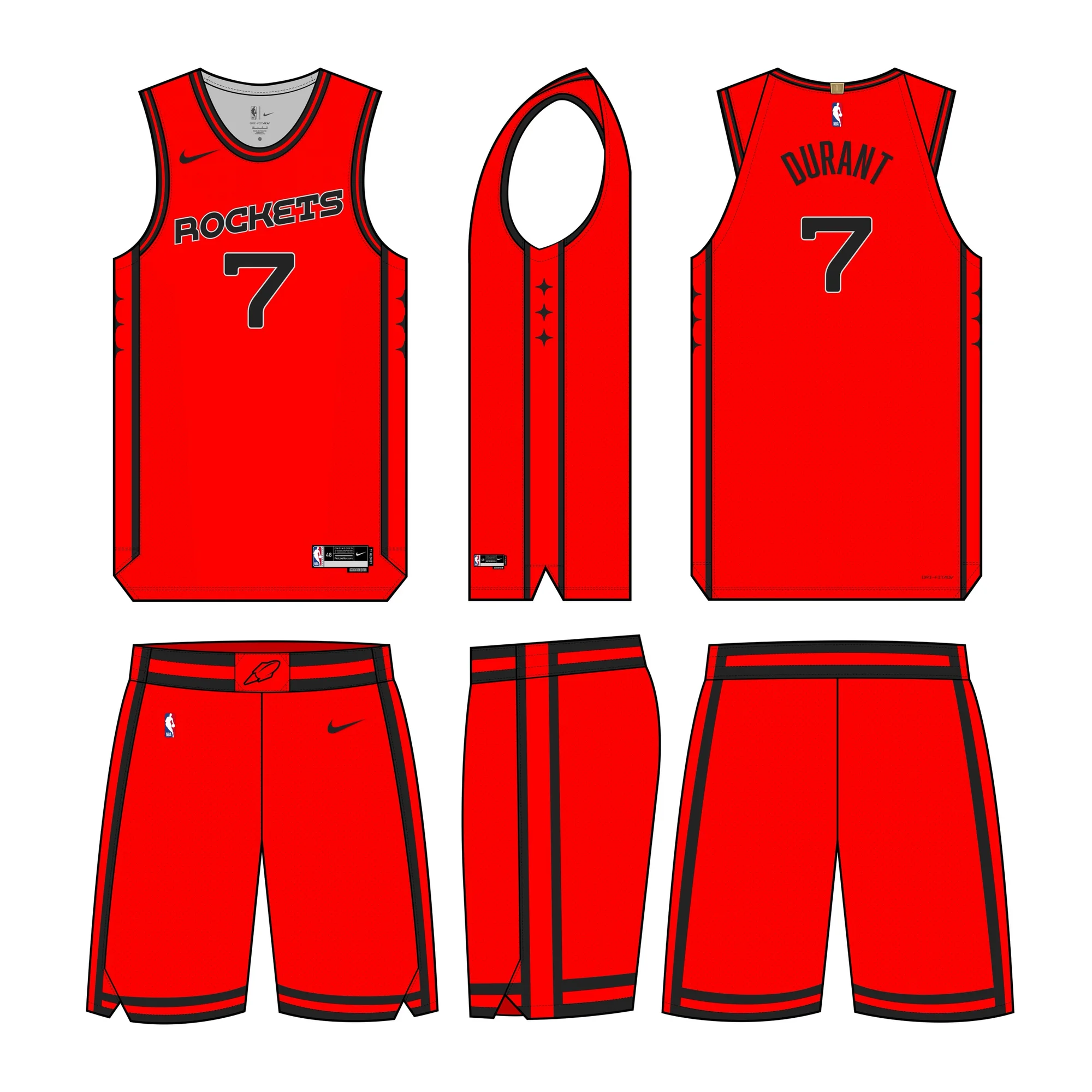
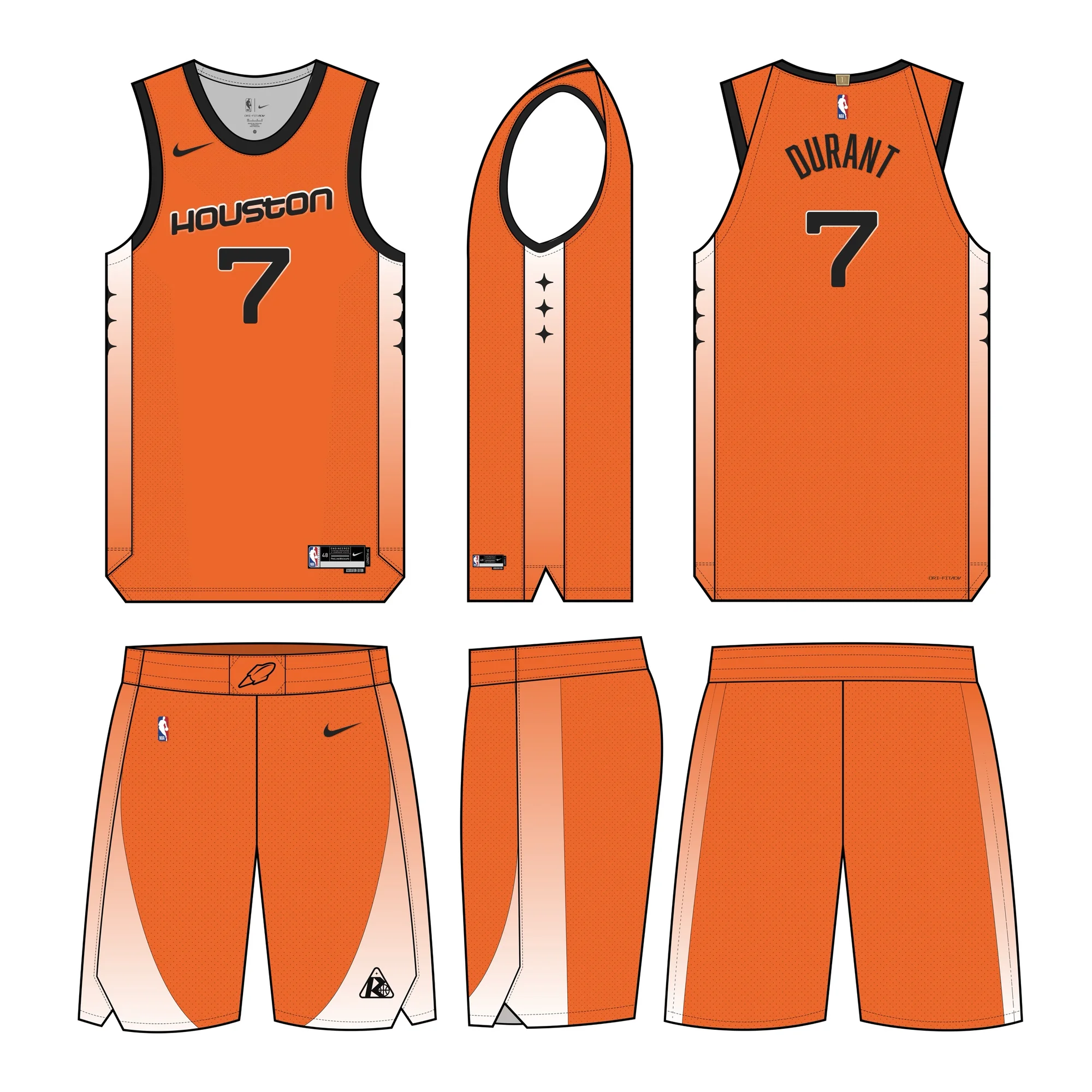
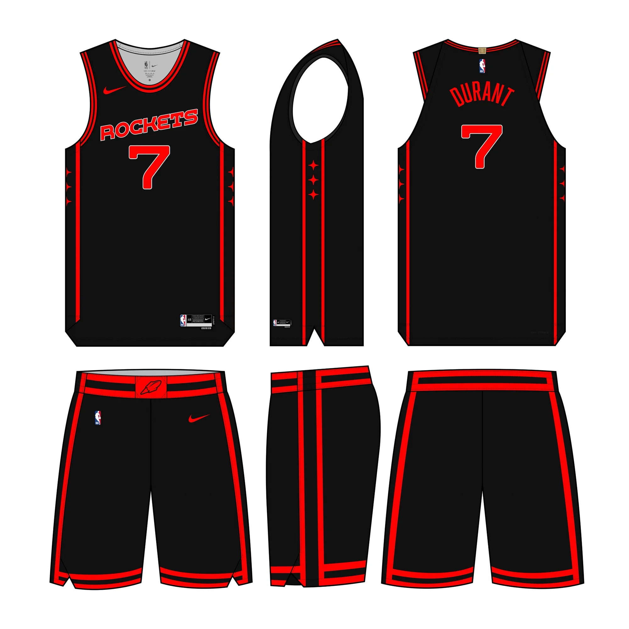
Uniform System — Icon, Association, Statement, and City Edition
The court design brings the identity into the physical playing environment. The layout uses controlled linework, strong center-court branding, and restrained color placement to create a floor that feels bold while remaining realistic for NBA use. Instead of over-decorating the space, the court applies the brand's core principles — structure, motion, and precision — in a way that supports the game rather than overpowering it.
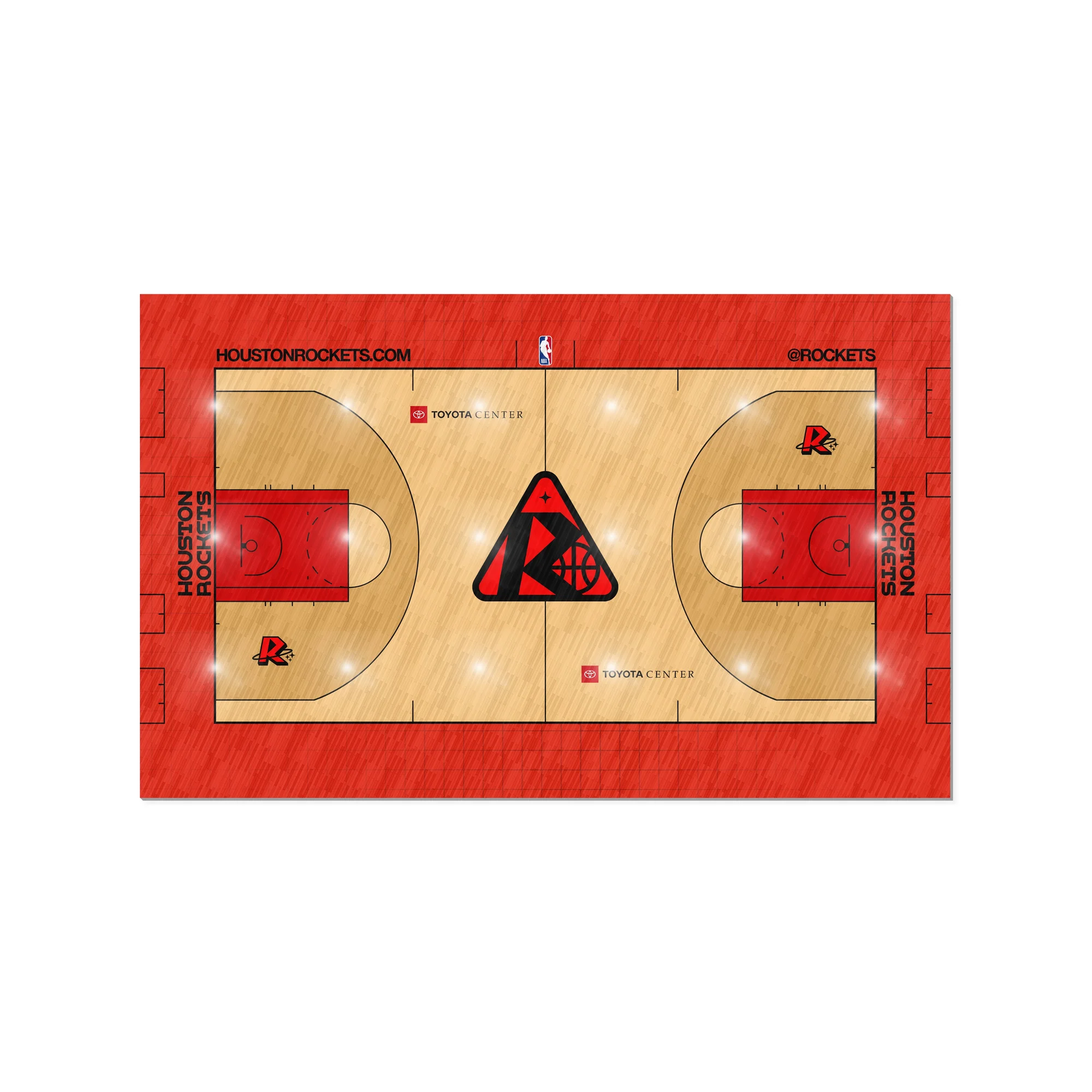
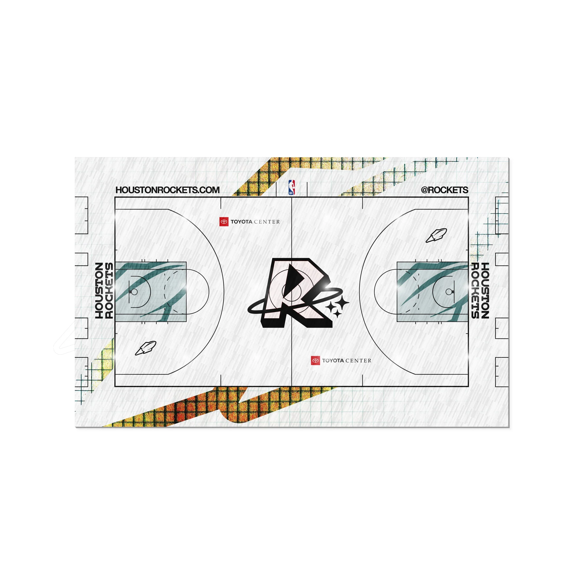
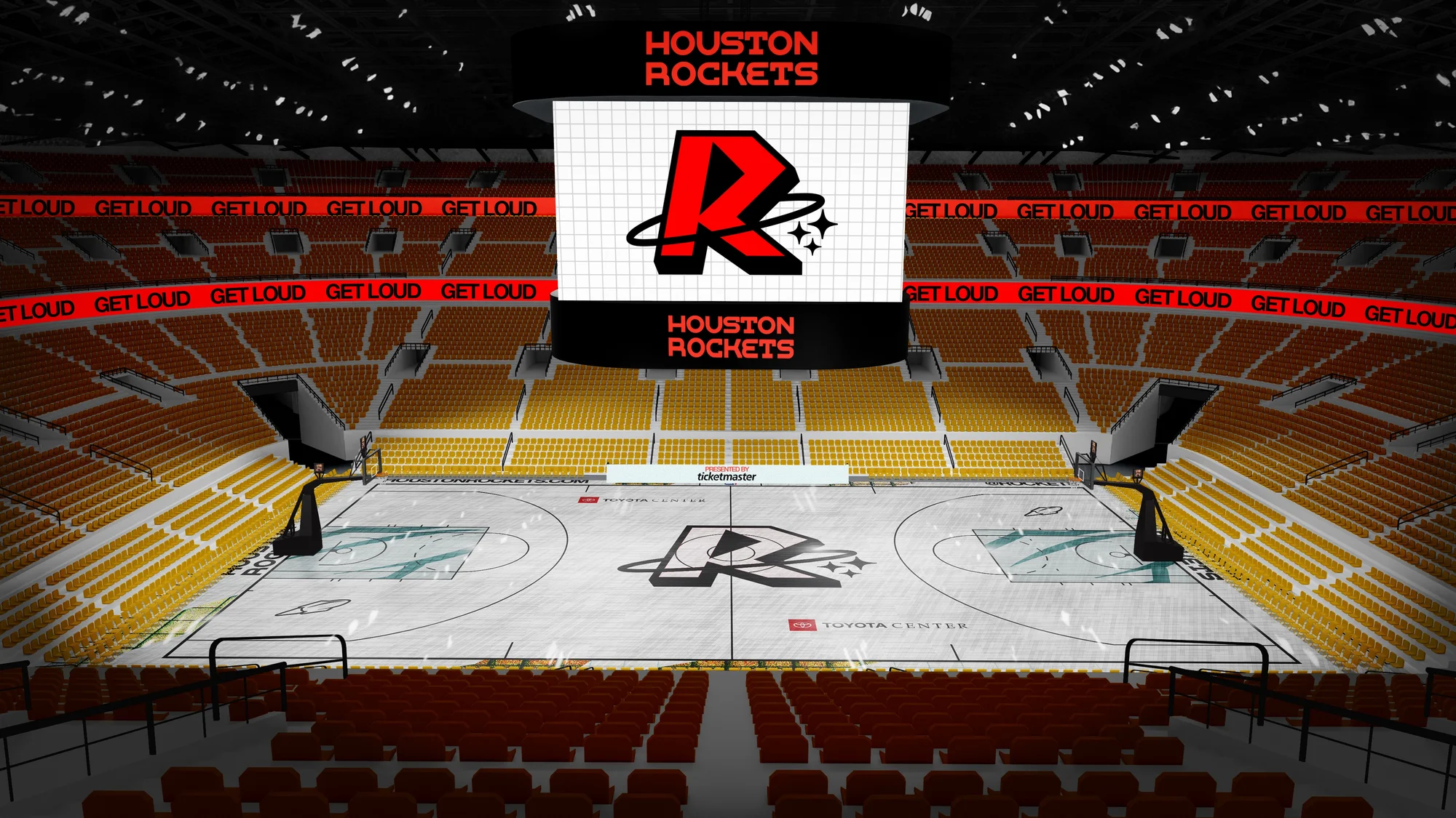
Court Design — Center-court identity and environmental layout
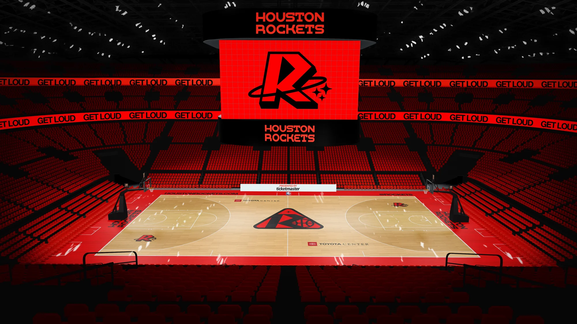
The arena applications expand the identity beyond uniforms and logos into the full fan experience. Tunnel graphics, LED signage, court graphics, and environmental applications use the same visual language to create a consistent atmosphere across the arena. The goal was to make the brand feel immersive without becoming theatrical. Each application uses the same system of typography, color, texture, and graphic structure so the identity feels connected from the court to the concourse.
The final brand guideline book documents the complete identity system, including logo usage, typography, color, uniforms, social templates, court design, and arena applications. This guide presents the project as a complete application system rather than a collection of separate visuals. It acts as the central reference for how the Rockets identity should be applied across digital, physical, and environmental touchpoints.
Contents
As an independent senior capstone concept, the final system repositions the Houston Rockets around Houston's culture of aerospace, engineering, and athletic energy. Across logos, uniforms, social media, court design, motion, arena graphics, and brand documentation, the project demonstrates how a sports identity can be built as a complete system — conceptually grounded, visually flexible, and ready for real-world applications.
Concept project. Not affiliated with the Houston Rockets or the NBA.
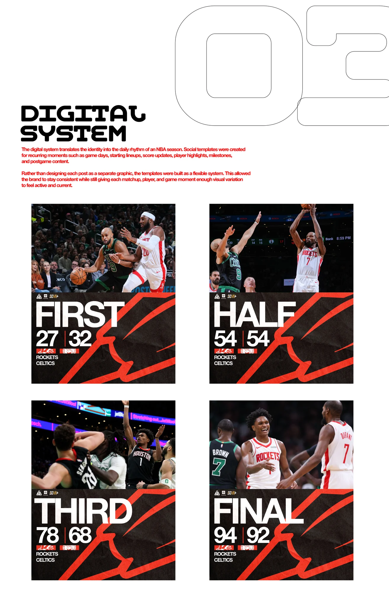
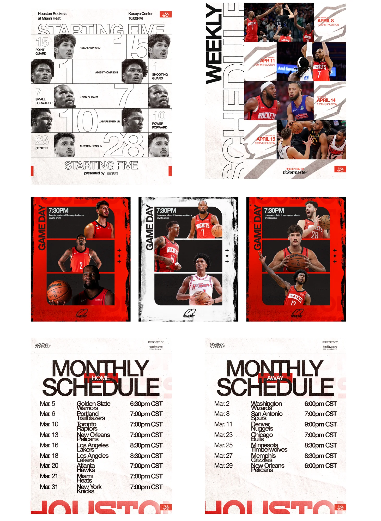
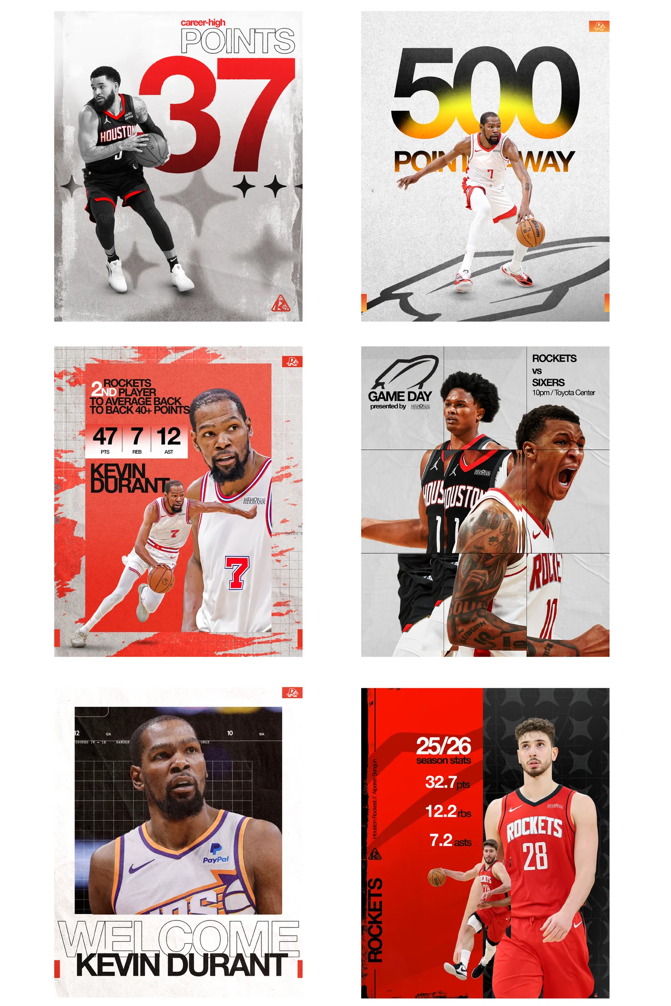
The social media system was built as a reusable campaign language for the 2025–26 season. Templates were designed for game updates, player stats, milestones, career highs, season recaps, and achievement posts. The system uses consistent type hierarchy, player imagery, texture, and structured layouts so graphics can be produced quickly while still feeling connected. The paper texture references NASA blueprints and engineering documents, while the distressed treatment adds pressure, grind, and ignition to the campaign tone.
Social System — Reusable templates for game updates, milestones, and player stories