Brook Vale Vineyard is a conceptual wine brand identity and packaging system built for a mid-range vineyard with a focus on approachability, craft, and shelf presence. The project included creating a logo system, wine labels, bottle mockups, and a shipping package that could carry the brand across multiple touchpoints. The identity uses earthy tones, structured typography, and simplified landscape forms to create a brand that feels grounded, natural, and refined without becoming overly traditional.
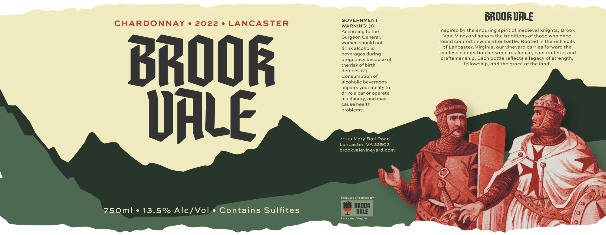
Chardonnay — Front Label
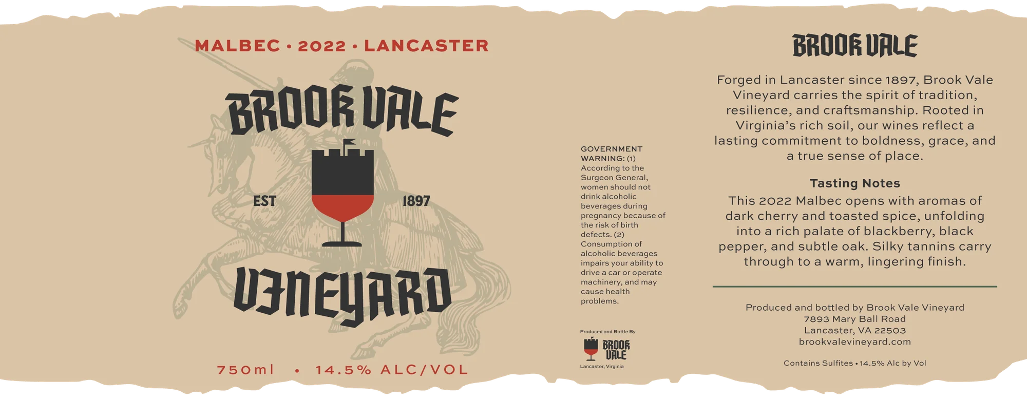
Malbec — Front Label
The label system was designed to work across different varietals while keeping the brand recognizable. Chardonnay and Malbec use the same core structure, typography, and layout system, while color and supporting details help separate each bottle within the product family.
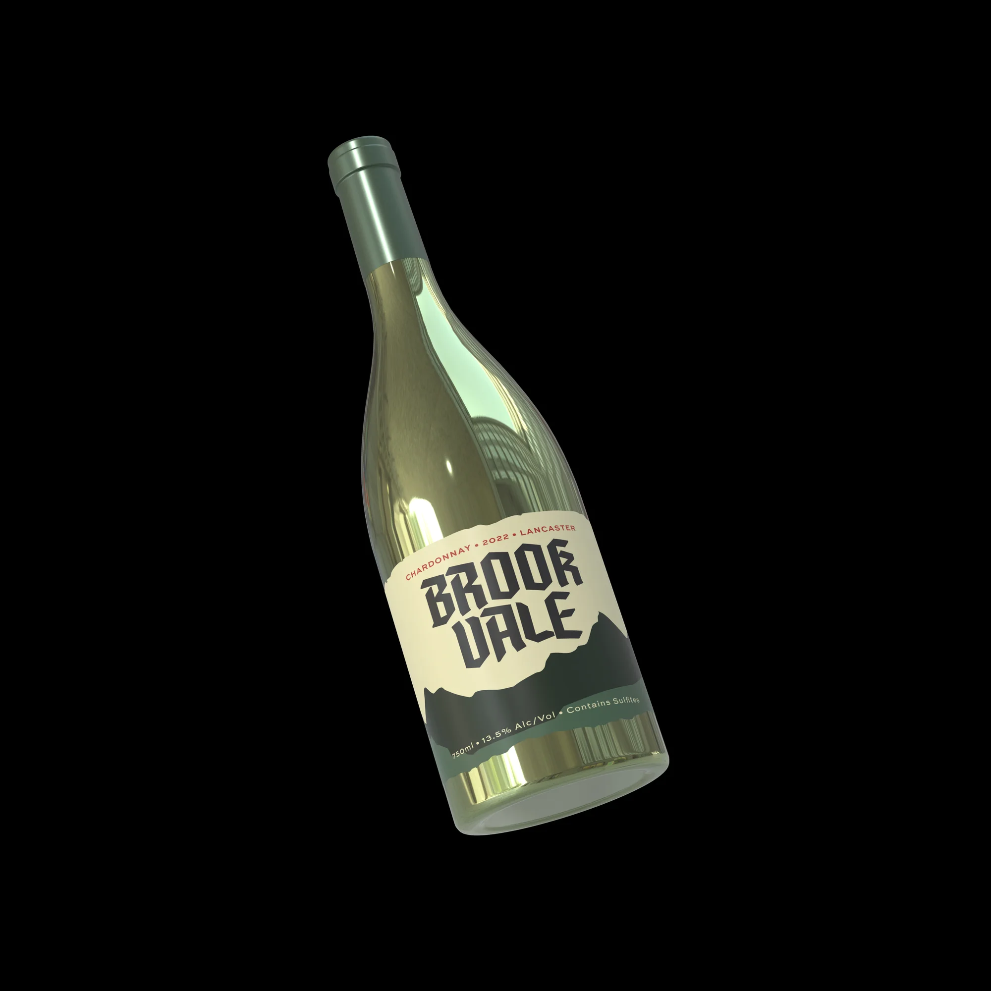
Chardonnay — Front
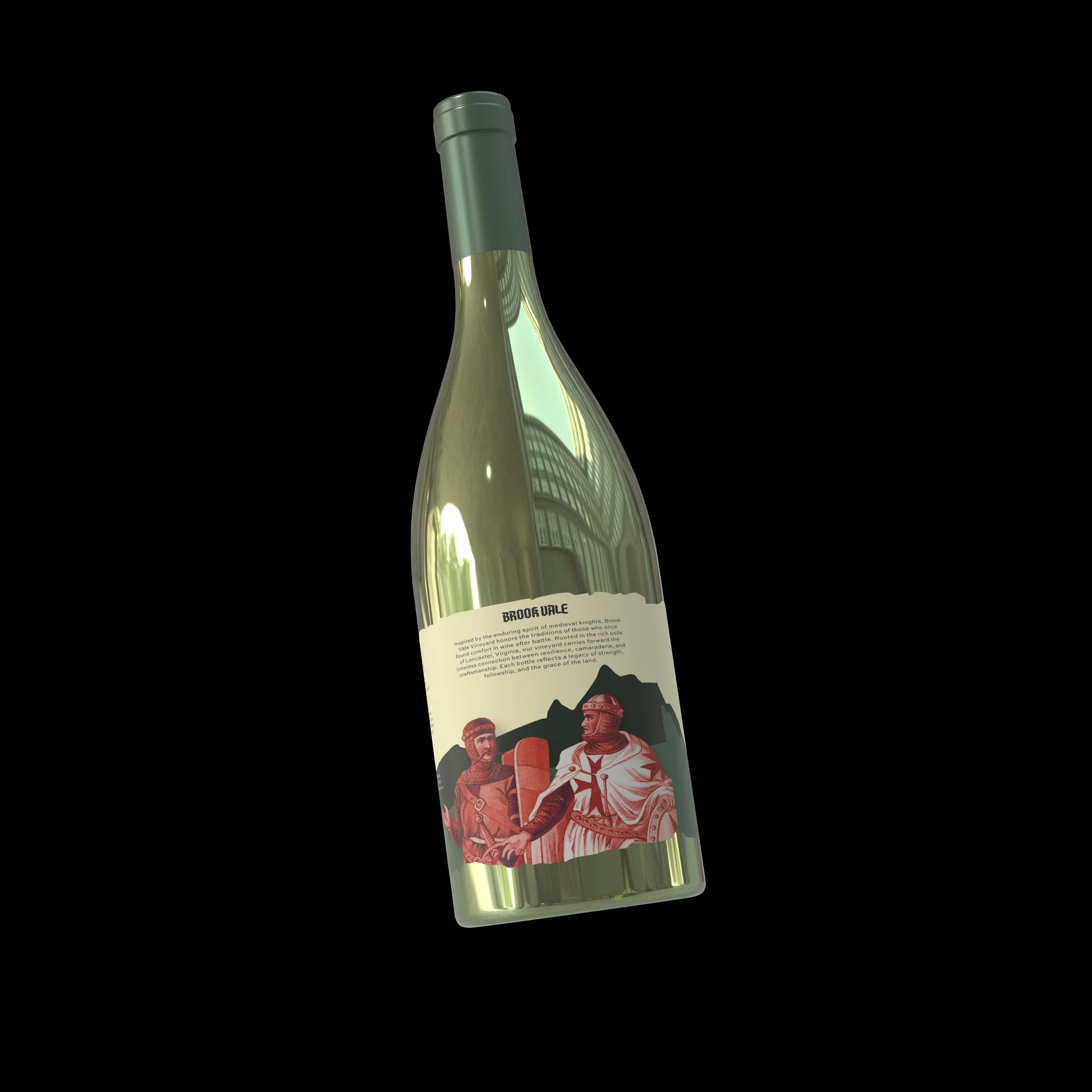
Chardonnay — Back Label Detail
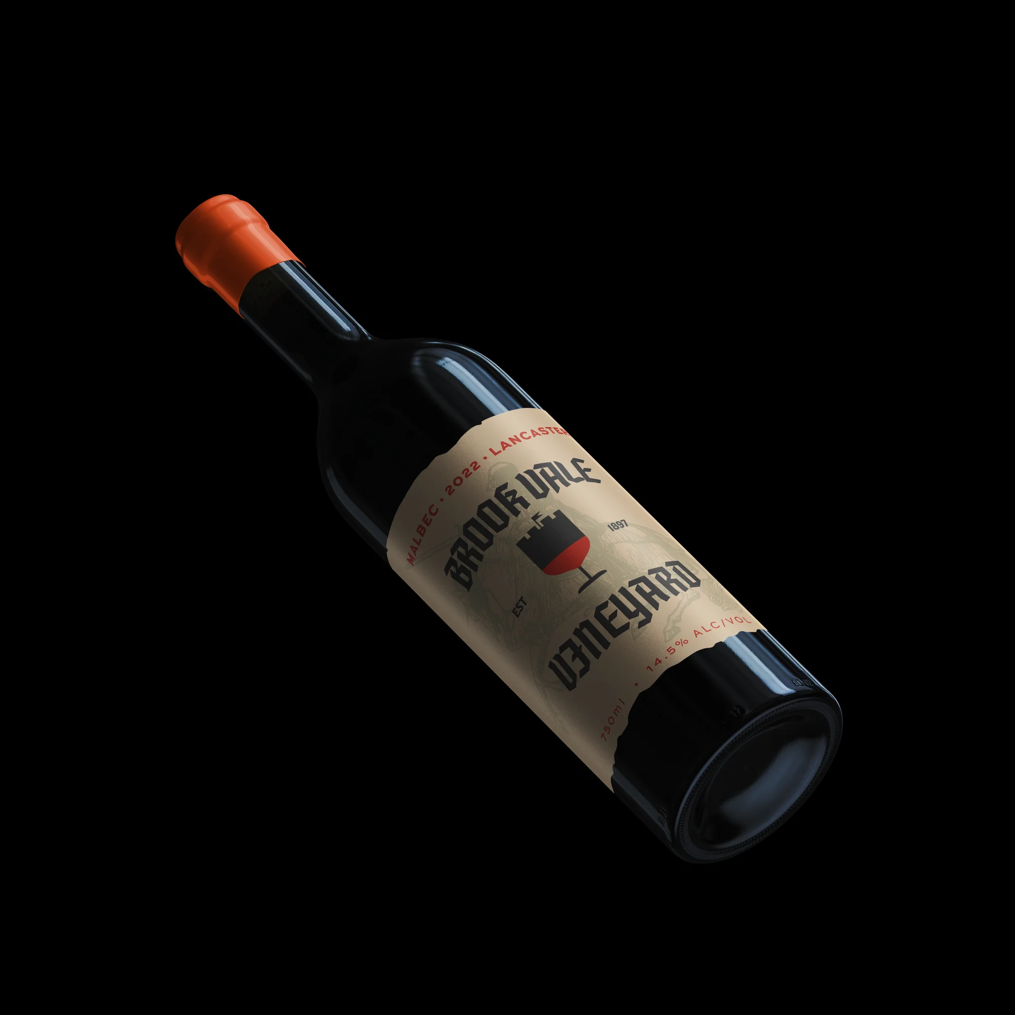
Malbec — Front
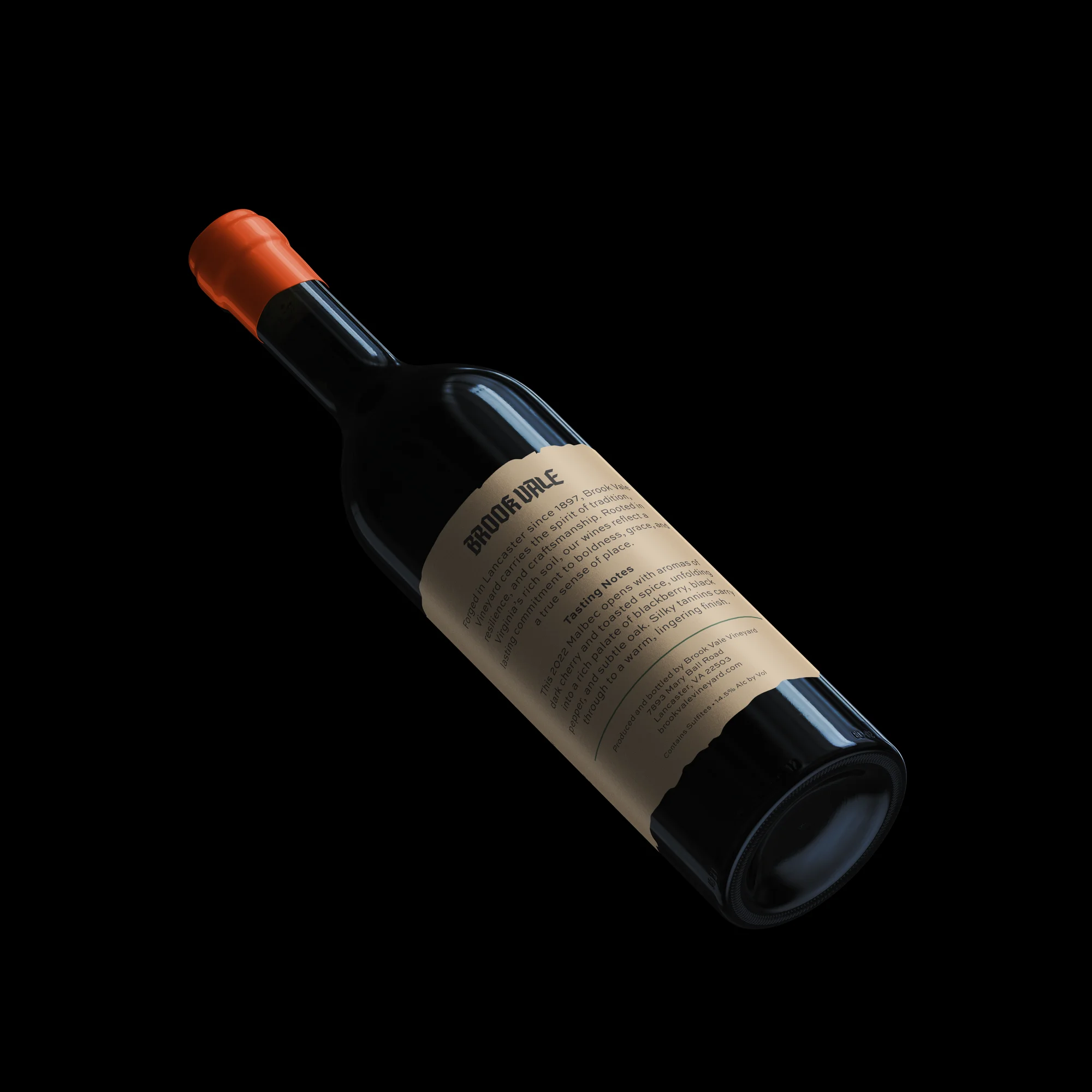
Malbec — Back Label Detail
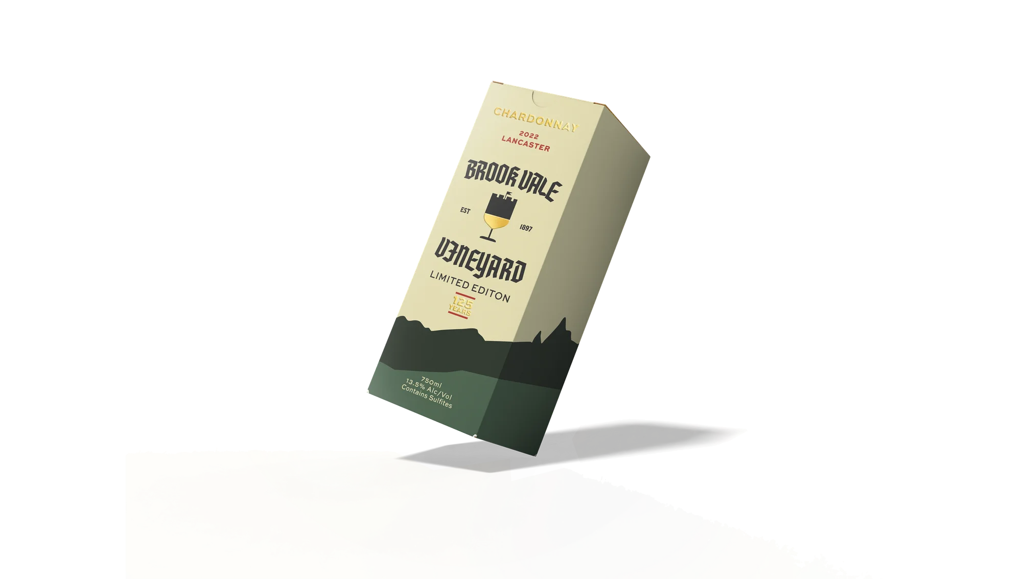
Box — Front Panel
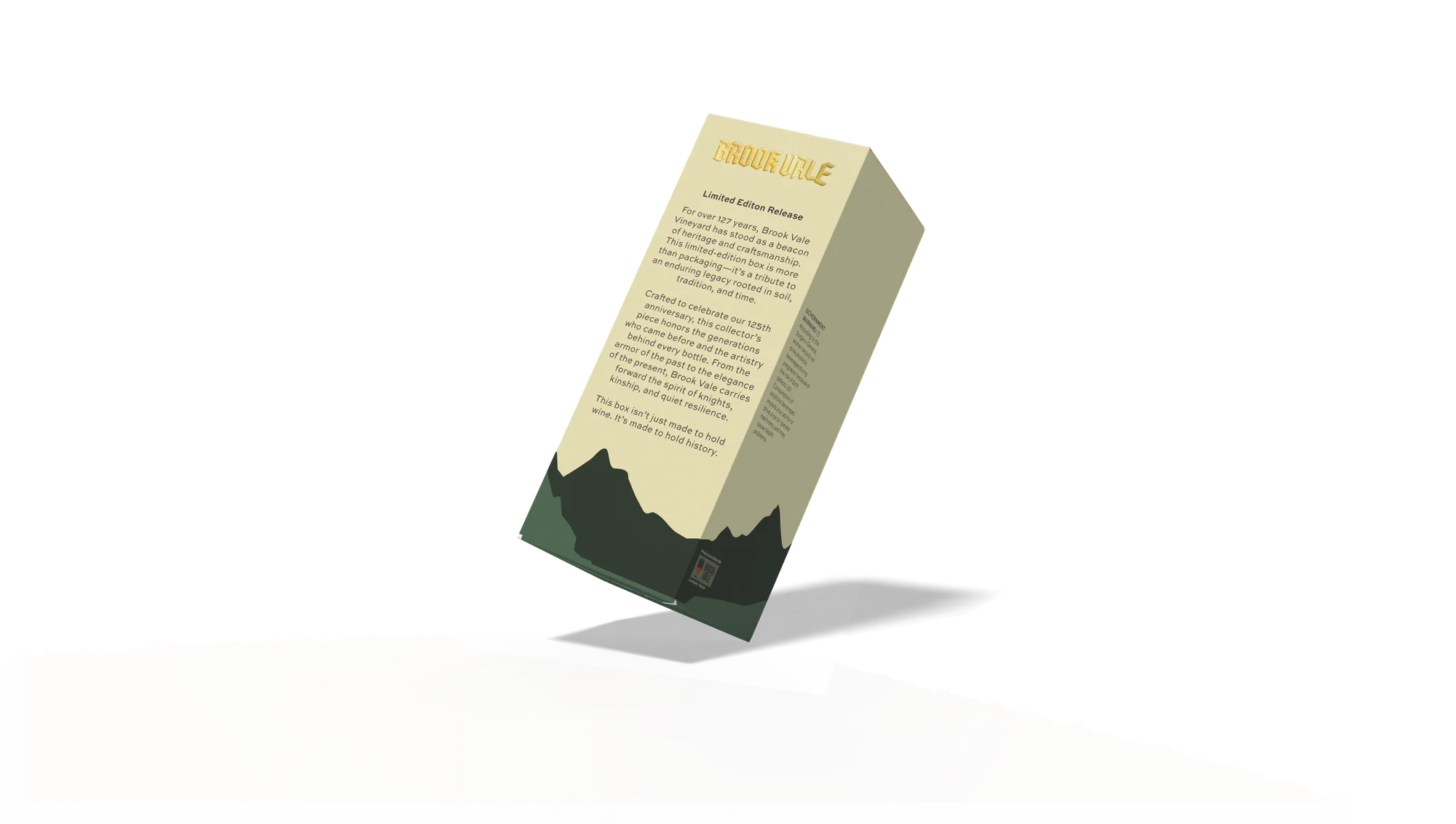
Box — Back Panel
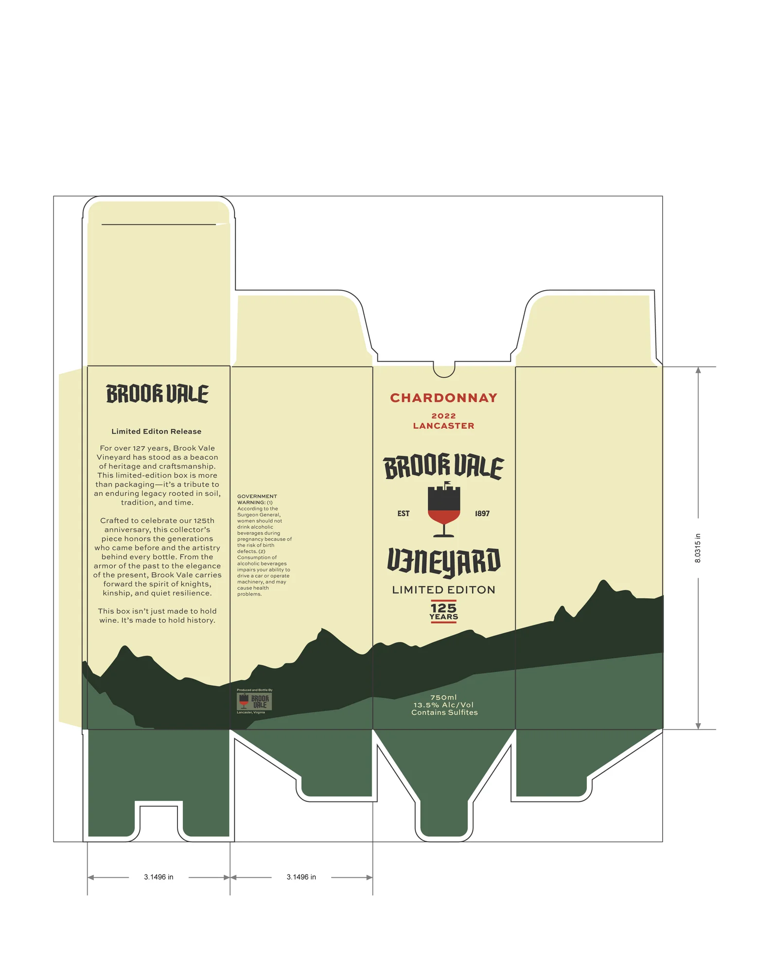
The packaging extends the label identity into a shipping box using the same color story, typographic hierarchy, and landscape motif. The box was designed to feel connected to the bottle design without becoming too crowded, reinforcing Brook Vale as a cohesive vineyard brand.
Brook Vale helped me explore how a brand identity can move beyond a logo and become a flexible packaging system. The project focused on creating consistency across labels, mockups, and packaging while still allowing each wine variation to have its own character.