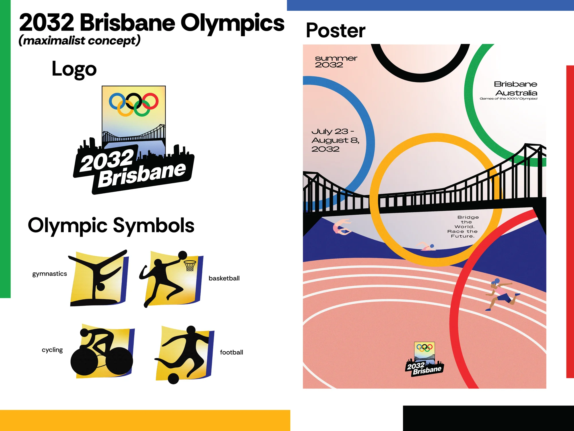
Brisbane 2032 is a conceptual brand identity and design system for the upcoming Brisbane Olympic Games. The project focused on building a refreshed visual identity — logo, symbol system, color, and poster applications — rooted in Brisbane's landscape, climate, and sense of place. The rebrand uses bold primary forms, a simplified emblem system, and a warm color palette to create an Olympic identity that feels energetic, modern, and distinctly Australian without relying on generic sports iconography.
The identity direction was grounded in the idea of movement — athletic, geographic, and cultural. The design system uses geometric forms drawn from Australian landscape references, organized into a flexible system that works across signage, print, digital, and broadcast environments. Rather than replicating Olympic design conventions, the goal was to create something specific to Brisbane — a visual language that could feel at home in the city while carrying the scale of a global event.
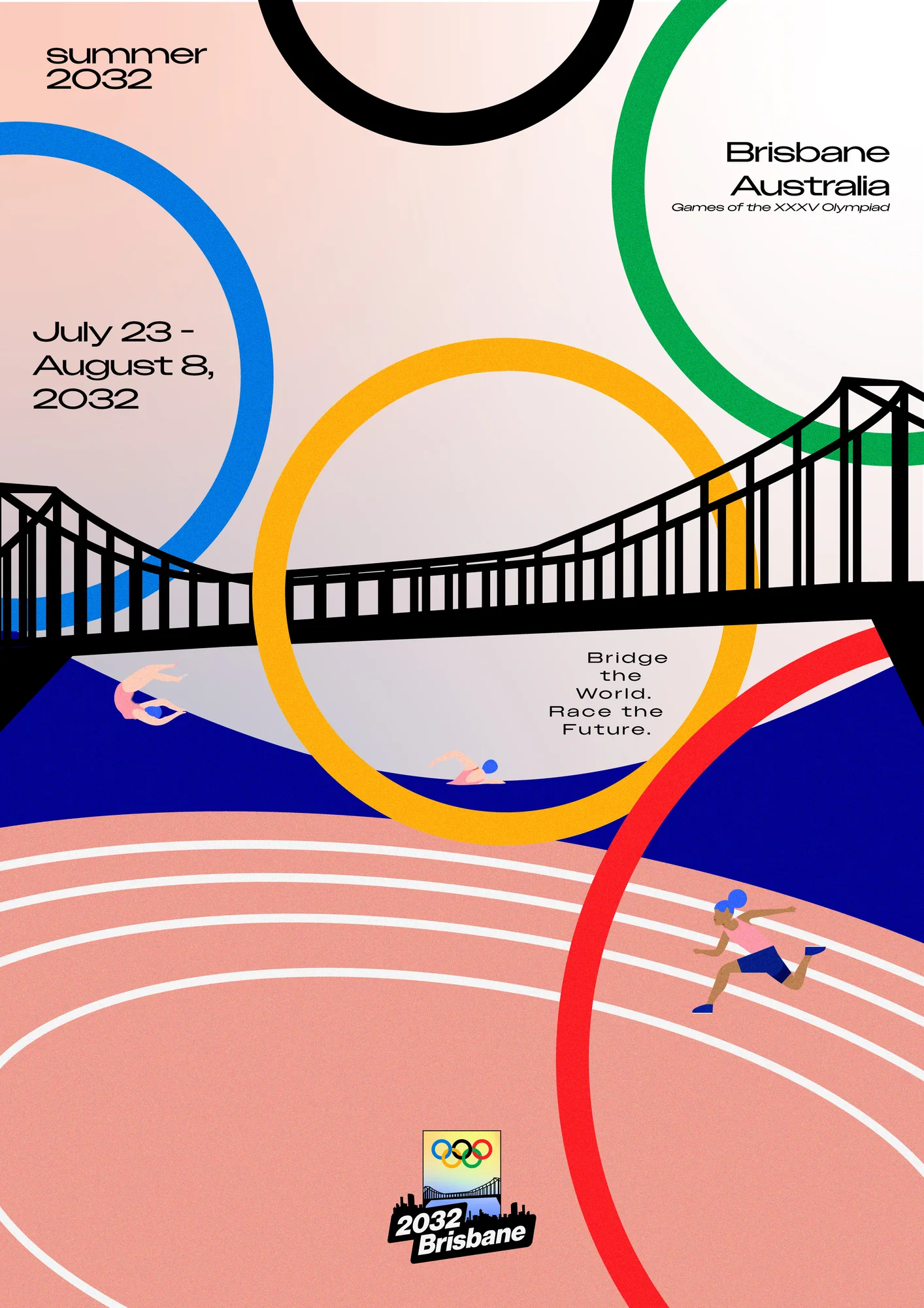
The poster system tests the identity across a full-bleed editorial format. Color, typographic hierarchy, and spatial composition are used together to create a piece that functions as both a promotional object and a design study — showing how the identity holds up at scale and with visual pressure applied.
The design process was grounded in a research phase documenting the history of Olympic identity systems, the visual precedents for host city branding, and the specific context of Brisbane as a site. The research informed decisions about color, form, and cultural reference throughout the project.
This project helped me explore how a city's identity can be translated into an Olympic brand without becoming generic or illustrative. The focus was on building a flexible design system that could carry meaning and visual energy across every touchpoint of a major international event — from a logo mark to an environmental sign to a printed poster.